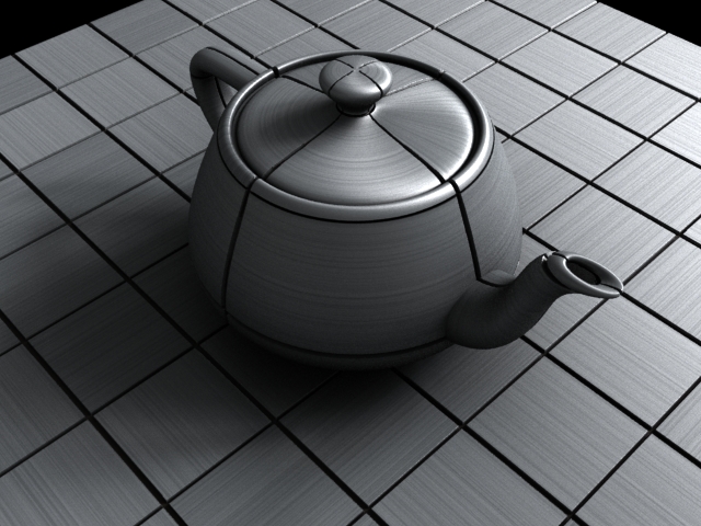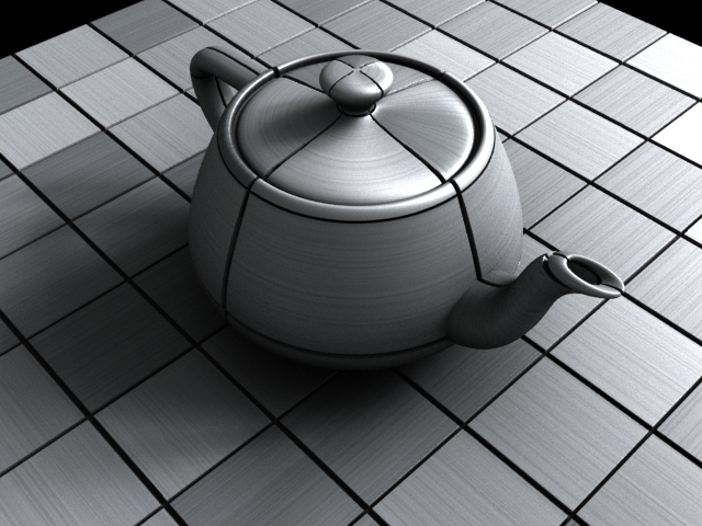
In trying to set up a lighting test for the shader and seeing how fast it rendered, I tried to turn up the diffuse bounces to get a more realistic feel on the render. It didn't do anything. Apparently, the way I made the shader with the lambert making the diffuse calculations did not take into account bounces. Now, it does! I just plugged in the physically based diffuse node rather than the lambert.
|
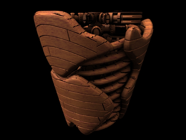
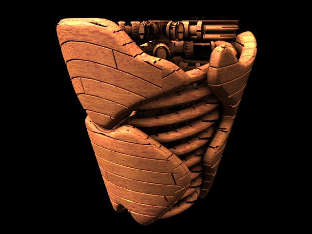
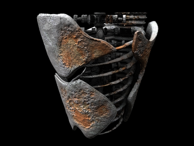
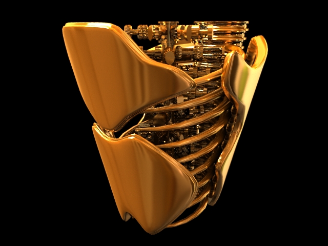
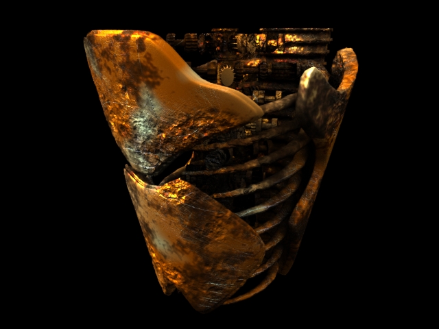
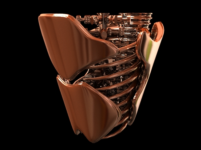
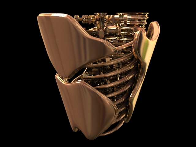
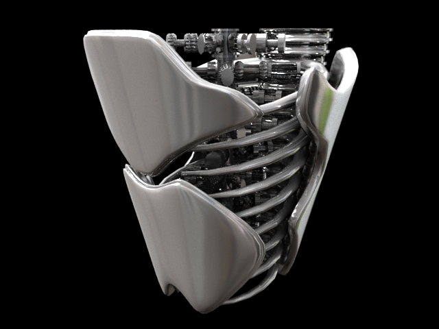
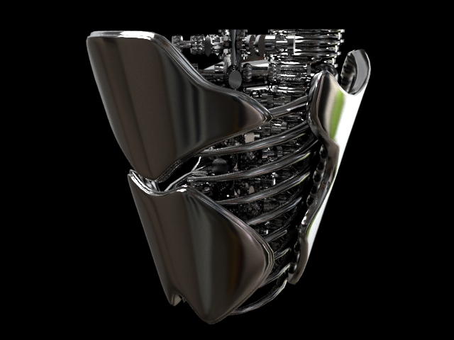
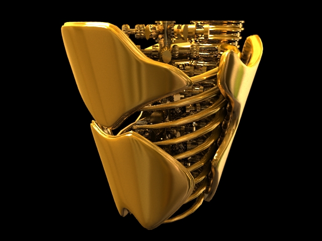
The shader now has defaults for different metals and different finishes of the metals including: gold, copper, brass, bronze, silver and chrome in aged, dull and polished finishes. The buttons change the diffuse and spec colors depending on which metal is chosen and changes the diffuse and spec intensity, highlight angle and scratch/denting options depending on which finish is chosen. This was another VEX exercise for me. Here I focused on altering the pattern per face. Metal Tile Features:
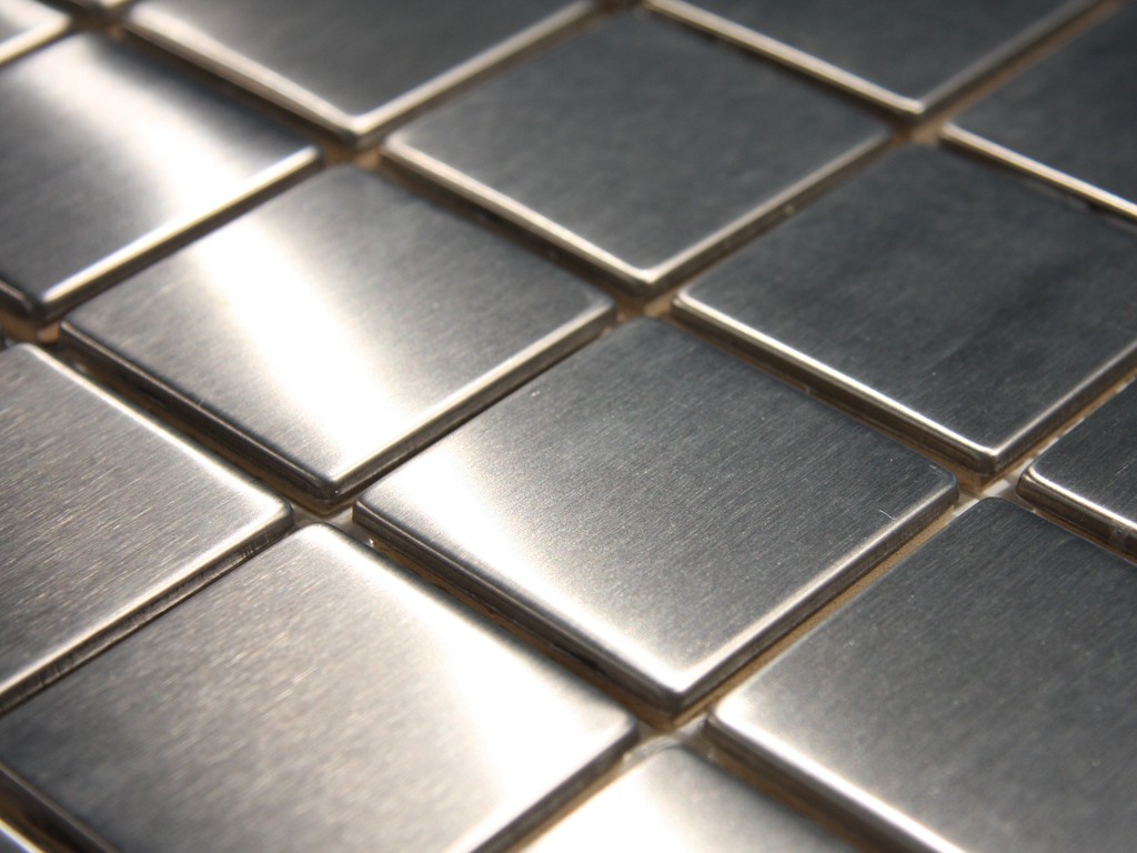
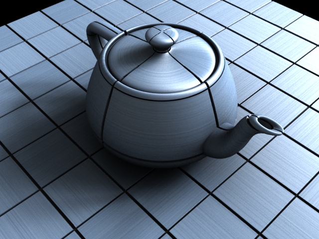
In addition to figuring out how to rotate around the face, I had to rework the specular component of the shader in order to make it function like a real shader rather than one that just outputs maps. I switched from using a trace SOP to using PBR specular. I like the way this has turned out. I need to allow the option to change the rotation of the tile at something different than 90 degrees. Also there needs to be an option to have this brushed metal as a standalone texture, tiles based on UVs in addition to the standard tiles based on primitives.

This is a repeating pattern of basically ellipses rotated alternately at +- 45 degrees. I'm trying to implement this one using vex only (yay coding!) by dissecting the soft dots sop. So far I've been able to replicate the dots and add the second "layer" of hashmarks in but I'm not able to rotate the ellipses properly. I've obtained a 30 degree rotation, as shown below. 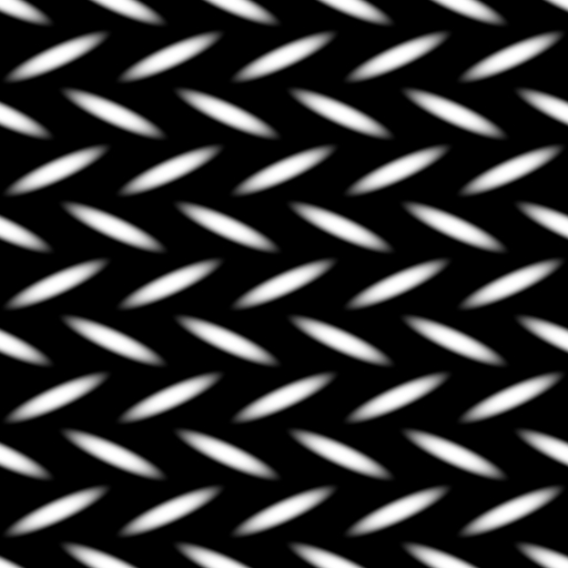
So far I've tried to rotate the UV coordinates based on a matrix before the ellipses are produced, rotate the ellipses using a matrix after they are produced and finally by altering the equation that is producing the ellipses. The latter has been the most successful but only stretches the shapes rather than physically rotating them.
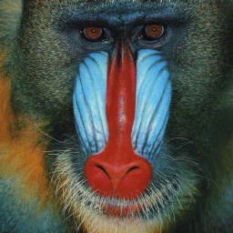
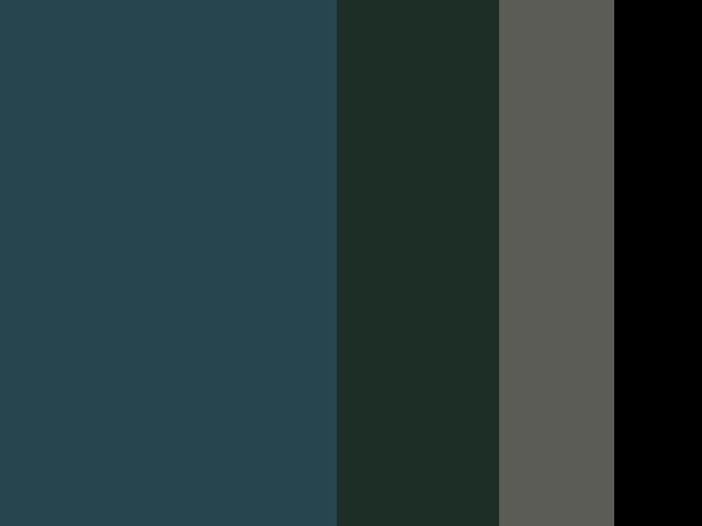
If the user has a reference image they like, they would want to use the colors out of it. This python node in COPs takes the image and generates a ramp node with the proportional values of the most prevalent colors.
Blurred and sharp images return different results, I like the blurred one better because it forces the computer to ignore (in this instance) the fur information and focus on the over all color. I'd also like to add preference based on the luminance of the image because to me, the bright blue and red and orange of the image are more important than the dark colors. This is not accurate to the photo but I feel that users choose reference photos based on composition of the colors rather than seeing the straight relevancy of them, otherwise they wouldn't need to use a chooser like this to pick their colors. User Inputs:
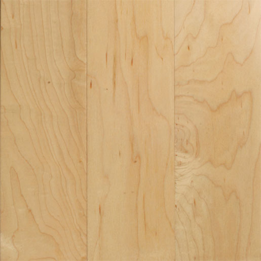
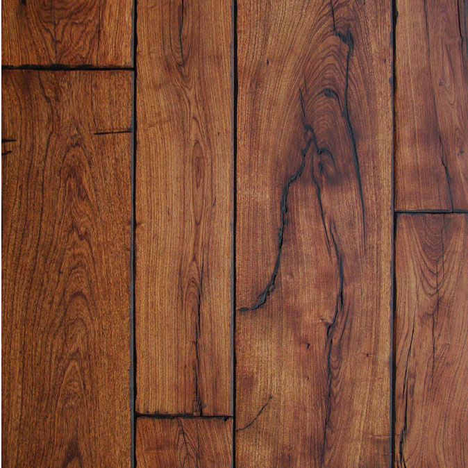
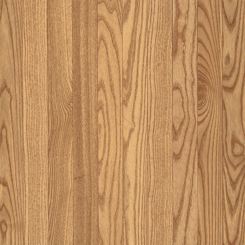
If you would like to learn a bit about the above woods, take a look here. Houdini has a node that does wooden planks (hooray!), so I'm currently working on modifying that so that the various planks are more random like real wooden planks are. I've put in presets for the various colors to reflect the above woods, just to give the user a starting point. I know that defaults help me figure out how the shader was built and what I am meant to do with it. 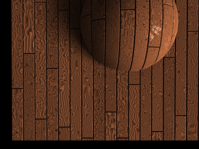 Now there are variations within each plank! But the wood grain is very uniform. In the reference photos there are large swatches of variations within the color then sharp lines of darker color on top of that. Now to figure out how to do that!  Blurry/sharp combination acquired! It does make it a little darker overall but I've put in controls so the user can control the levels separately. The mesquite wood has high levels of this blurry mess underneath the darker sharp lines. It also has cracks in the wood which I am going to simulate next.
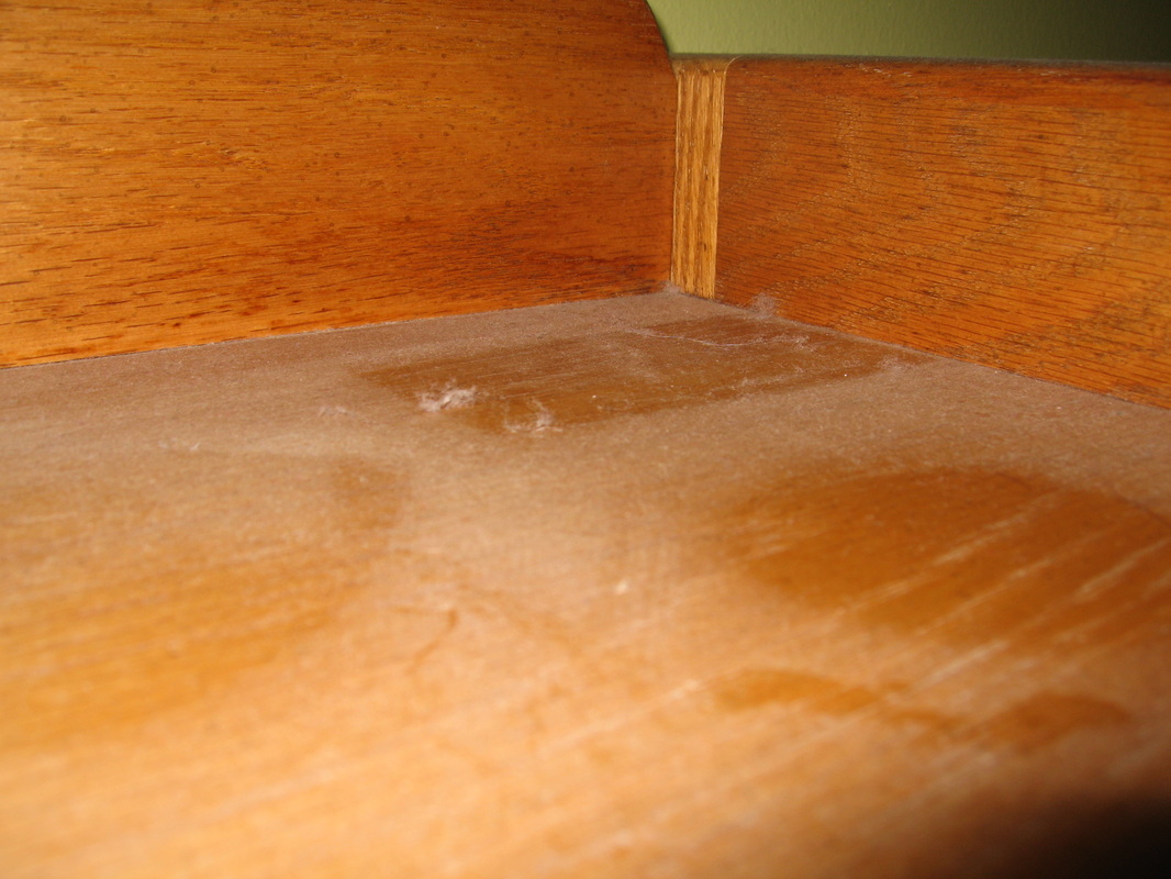
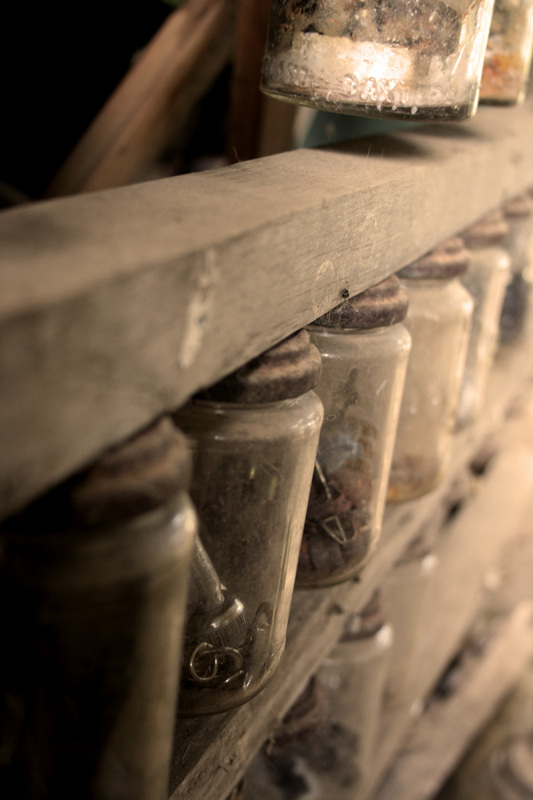
I probably could've taken my own reference photos for this but I'd rather not document my dust. Important aspects of dust:
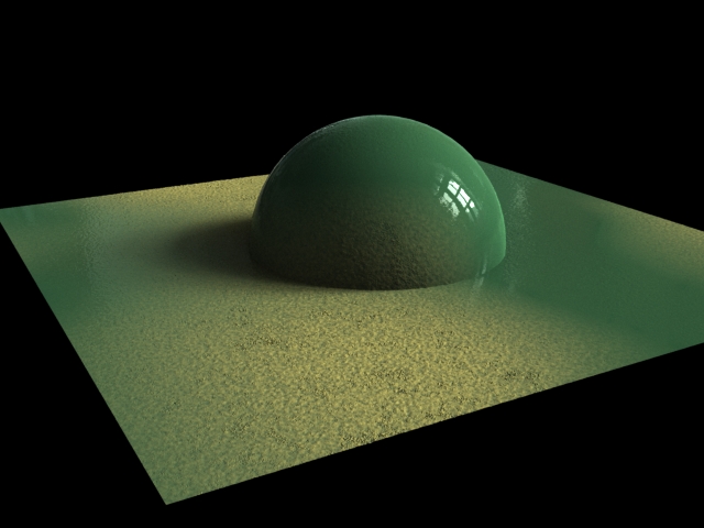
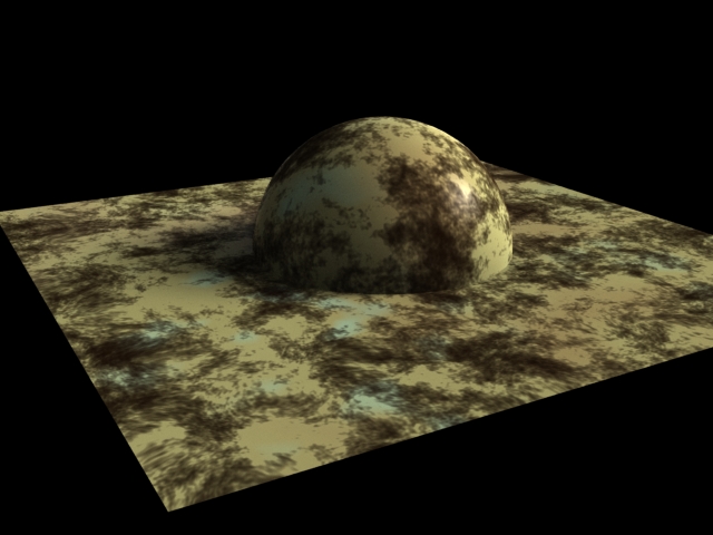
Basic dust formations have been acquired!! I like the left handed image better, it has the saturation component taken down where the dust is to create the illusion of a fine layer of dust over the surface rather than just the flakes of dust created by the displacement. The dust does not seem to need many variations or parameters since it's just a particulate layer on top of an object.
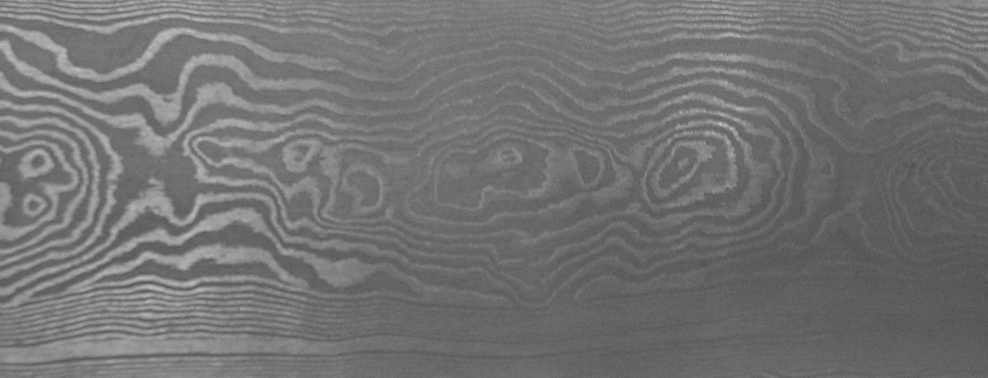
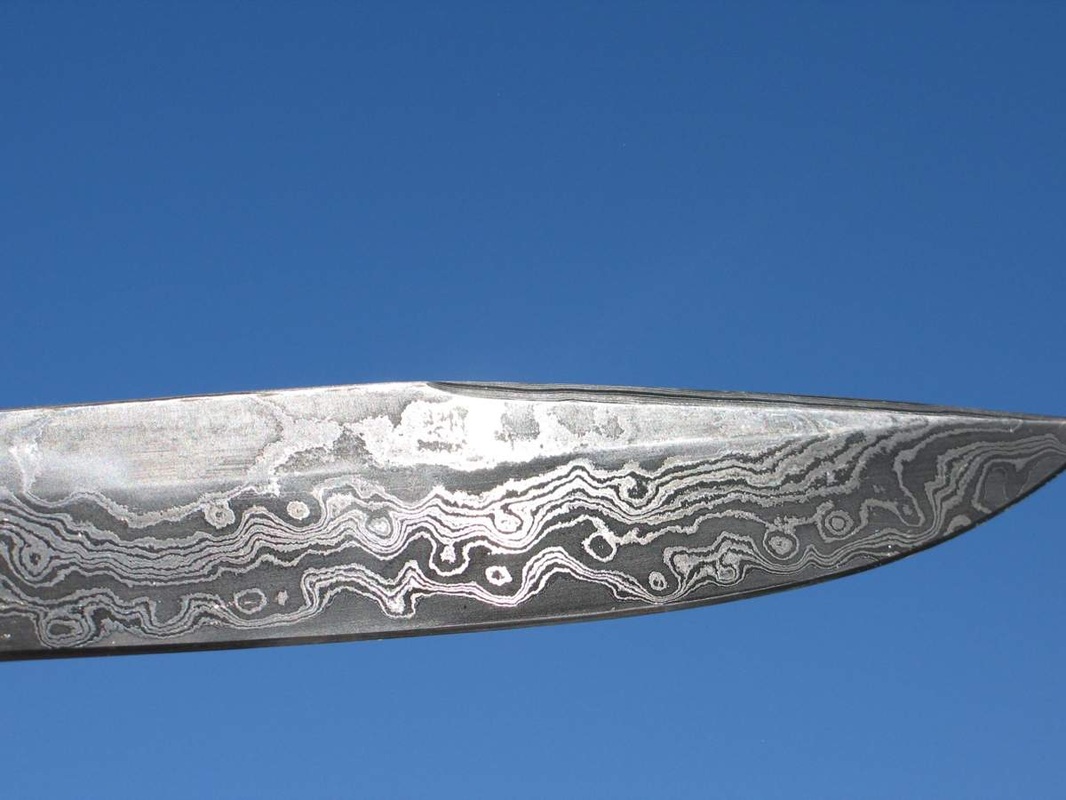
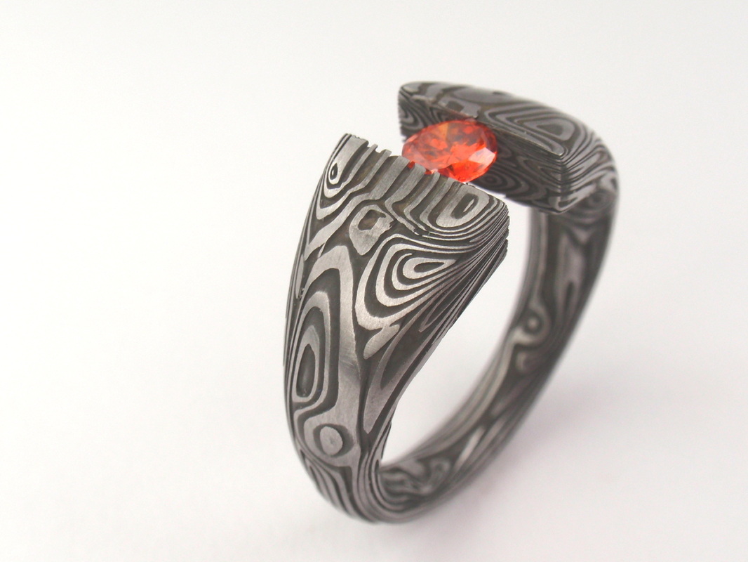
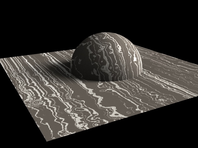
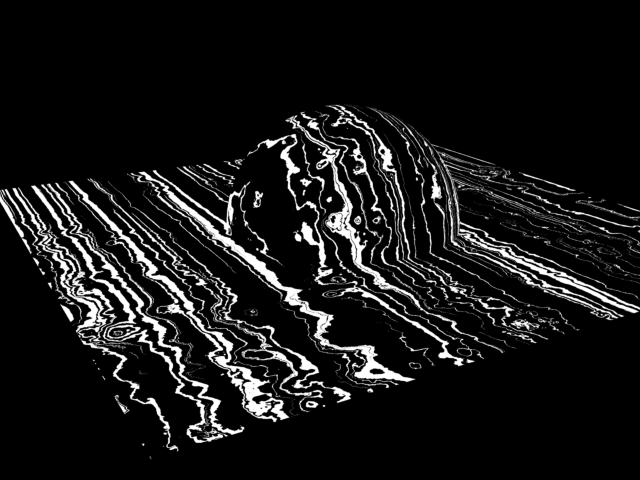
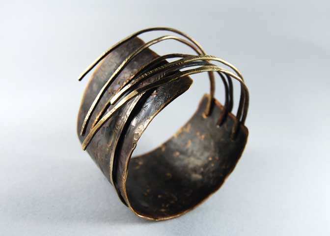
I covet one of these blades, the pattern on it is gorgeous and if you can get a real blade then it is incredibly durable. That seems to be the problem though - getting a real Damascus blade. Note that mokume gane and Damascus are different; mokume gane contains many different metals whereas Damascus contains steel. It seems the proper art of forging the wootz steel with a high carbon content. This process is very picky though, too little carbon content and the metal becomes wrought iron, too much and it becomes cast iron. The heat must be kept constantly at the right temperature to ensure that the steel does not become cementite, which is extremely fragile plate iron. It seems much easier to create a blade of this durability without the pattern welding element. Word of warning to those who would go to renaissance faires and buy a blade: these patterns are generally soft so make the vendor demonstrate it first. Unless it's Angel Sword, then that's fine. However this is CG so we can do whatever we want!! This will be a base element like the tiles, rather than an additive process like the water stains or moss. I need to add that into the shader so that one cannot pick tiles and Damascus. Elements of damascus:
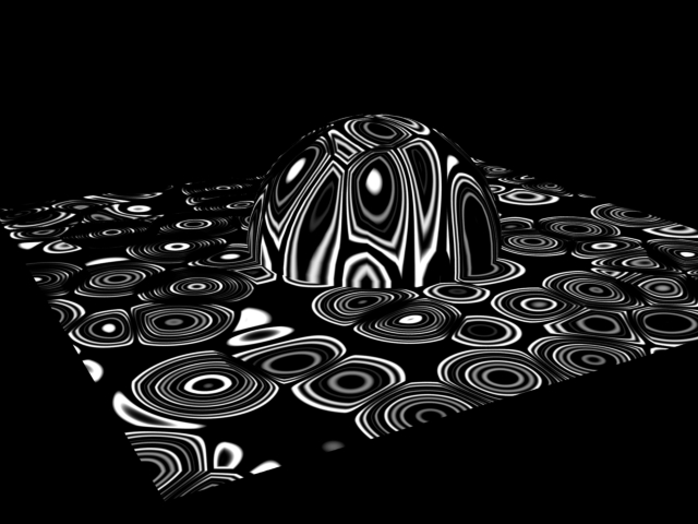
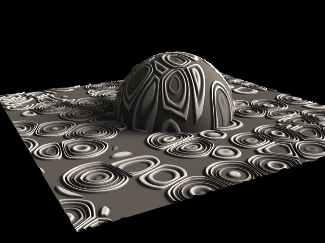
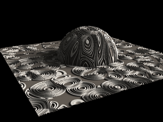
I like the way this is going, I want to add some more presets in the form of buttons that interactively change the settings on the noise patterns in order to give the user better jumping off points. The defaults are set to create the above images (not the concentric variations, hence the title of "variation"), but I don't think that it's enough. I have covered the scope of my reference images however, but I'd like to find more of a happy medium that has the lines and the concentric circles.
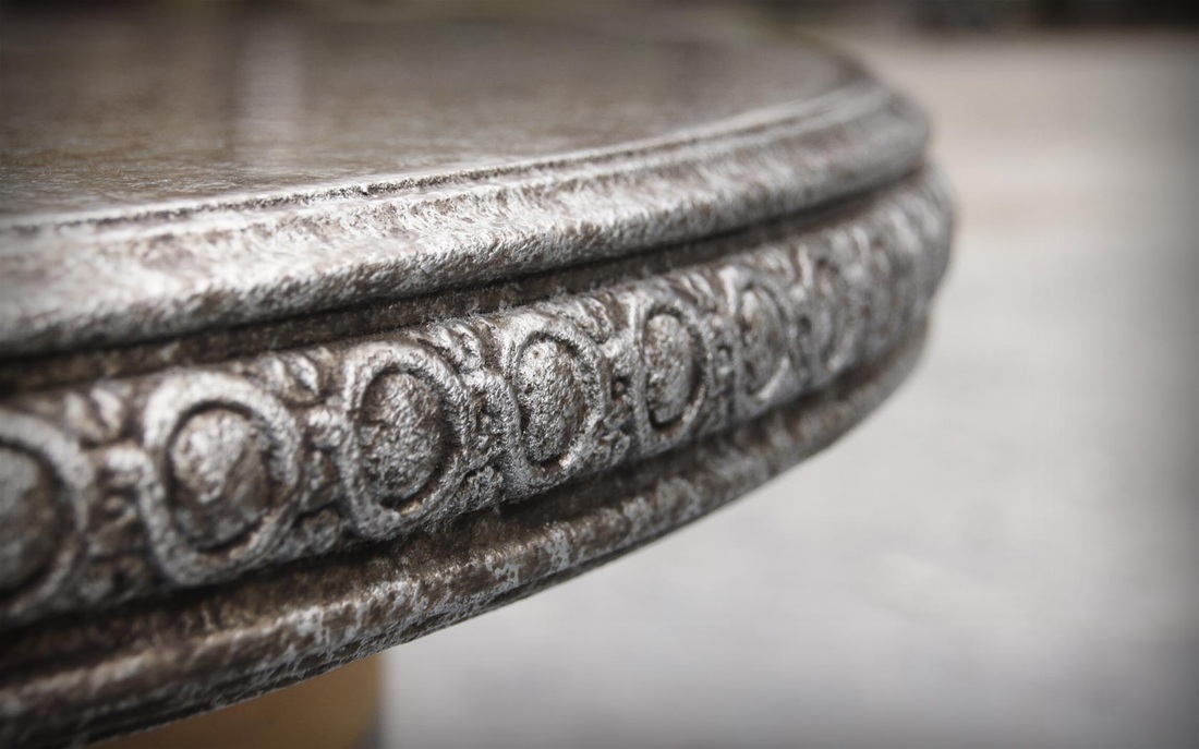
Continuing with the metal theme:
The patinas on all the reference images I found, not only the ones I posted, were all over the object. I hesitate to add the ability to restrict where the patina goes within the bounds of where the shader is applied on the object.
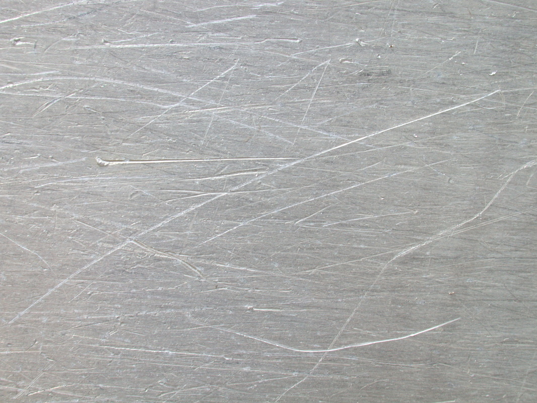
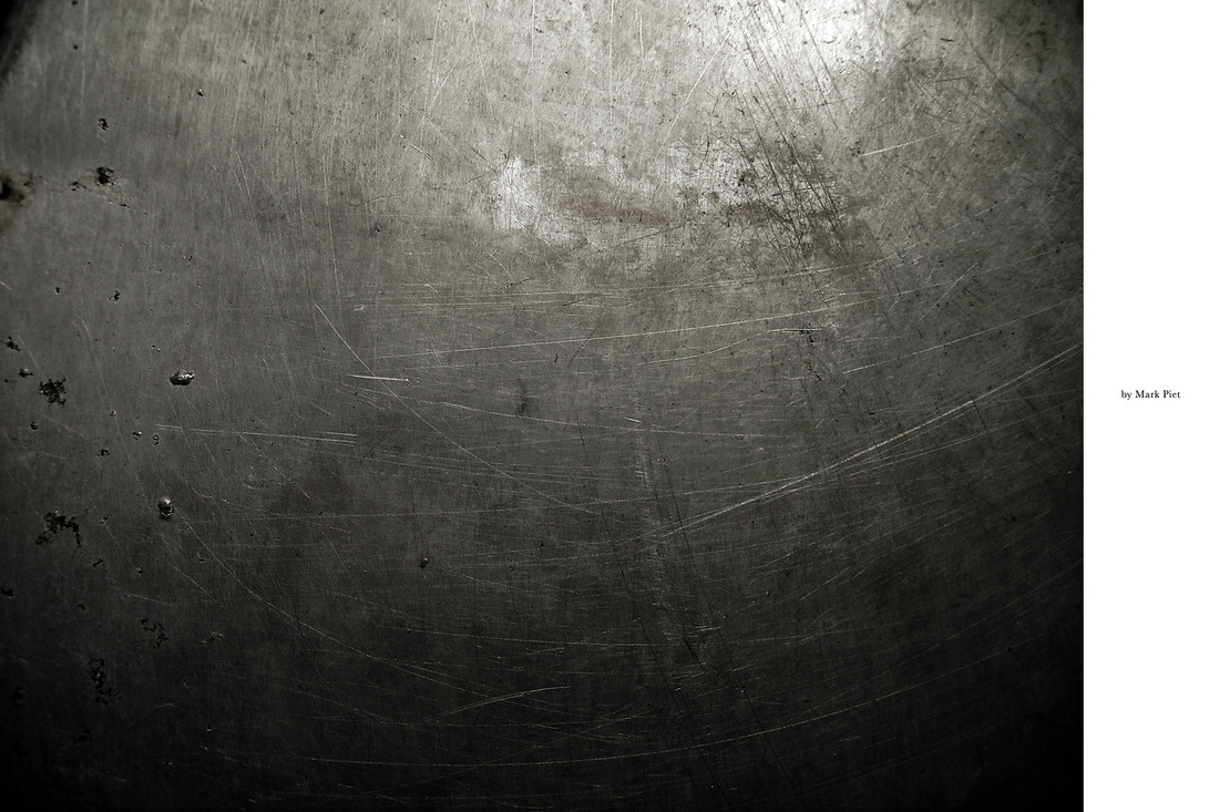
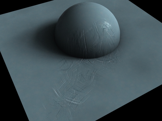
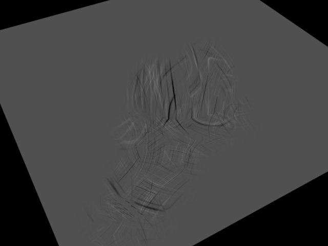
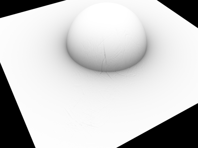
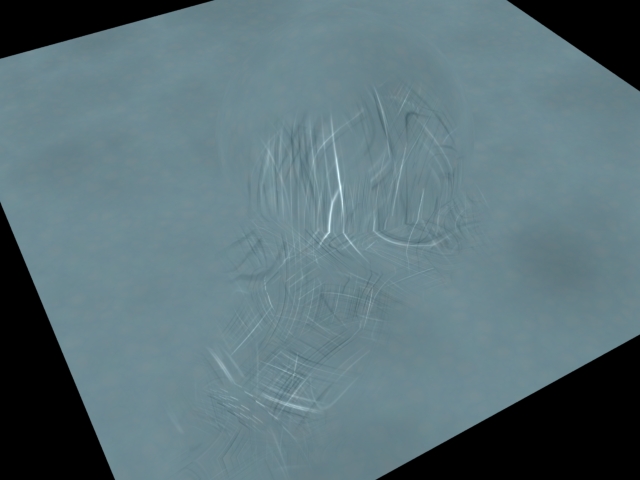
The patina is currently only affecting the diffuse and specular maps because the patina really does not have a particular height or bumpiness, that is all coming from the roughness of the object. Making the UI for this pattern was interesting, moreso trying to lay out the adjustable options in a logical manner. I do not promote all the parameters on a noise SOP so that the user is not bogged down by all the options. I also control the look of the shader to stay near the defaults this way. Time for metallic scratches!!
I am fairly happy with the shape and pattern of the scratches and how they are displacing the surface but not how they are coloring it. 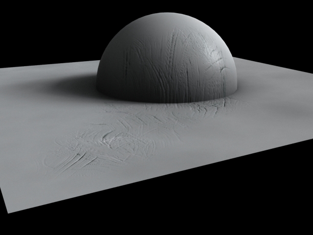 I like the way this is starting to look, there's more variation within the cracks. However I'm missing the very fine scratches that don't displace the geometry but just change the spec and color. |